


If you do a quick survey of design-forward websites you’ll most likely find that motion and web animation has become a common feature—images and text appear to fade into the page, sign-up blocks slide in and out from offscreen, buttons morph in response to our clicks. Aside from being in vogue, animation offers designers and developers a powerful tool for increasing engagement with users. However, it also presents a challenge: despite being visually interesting, animations can actually distract and confuse our users. So how do we use animation to serve our content and create a greater connection between our audience and our websites?
What exactly is web animation?
Let’s first establish a common vocabulary; web animation is not to be confused with cinema animation—we’re not talking about Mickey Mouse here. The term web animation broadly covers many different methods of animation, such as user interface (UI) animation, CSS animation, and JavaScript animation. It can refer to anything from making a button shake when clicked to designing a complex digital game. At its most basic though, web animation is changing a property over a period of time. So while most people think of animation elements in motion, it also includes changing the opacity or color of an object.
Finding the Sweet Spot
One of the first things to consider when designing animations is the duration of a given action—i.e. how long does it take for an object to move or morph? Though it sounds simple, getting the timing right can be tricky; too fast and the animation will be abrupt and shocking, too slow and you risk boring or frustrating your users.
Fortunately, we have studies and best practices to guide our decision-making. Jakob Nielson’s seminal usability study on the interaction between humans and computers revealed three response time limits that are now as used as goalposts for animation timing. The study found that in 0.1 second (100 milliseconds) a computer response will appear instantaneous to a user—so an animation lasting 100ms would be imperceptible to most people. As the computer response time increased, the study showed that at 1 second, users’ attention was maintained but after 10 seconds, most users become disconnected or bored.
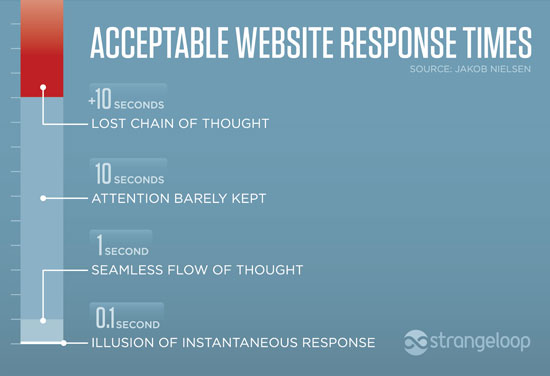
Studies also show that humans’ ability to perceive and process visual stimuli, known as a temporal beat, varies from person to person. Some people are naturally capable of perceiving very quick visual movement or changes. But as we age our temporal beat slows, making it more difficult to process quick visual stimuli. In other words, someone with a quick temporal beat might be able to see change as quickly as 70ms, whereas an older person might be able to see that same change in 700ms. To account for this significant gap in processing time, animations should be timed around the 100ms to 1 second “sweet spot” to ensure users are able to perceive the animation without being confused, but are not slowed down or pulled out of their flow of engagement with the content.

An example of the same website with and without animations. The gif on the right shows how animations help reorient the user to the new page.
Loading Animations
As users transition from one website page to another, we can use the sweet spot to help optimize their experience and the perceived performance of the site. Perceived performance is a measure of how long a user feels like they have been waiting for a website to load. Though one might assume the faster the better, we know from Nielson’s study that anything less than 100ms will appear to be an instantaneous jump cut from one page to another. Jump cuts can be confusing for users and overwhelm their cognitive load. We want a speedy website but not at the expense of our users’ ability to process the information on the page. So to signal transitions without boring users with a blank loading page, designers are increasingly using loading animations.
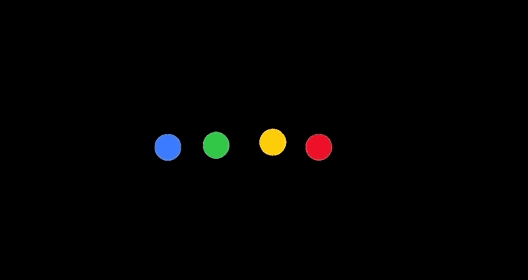
Google’s branded loading page animation
As well as helping to reorient the user to the new page, loading animations offer a chance to do something creative that further engages audiences. Viget ran an experiment to see how long users were willing to wait for a page to load with branded versus generic animations. They found that users were willing to wait longer and the abandon rate was lower with branded animations. The colorful and creative branded animations were intriguing to users, offering something they weren’t accustomed to seeing on other sites.
Eases
In addition to optimizing the duration of animations and page transitions, it’s important for animations to mimic the laws of physics so that they feel natural and intuitive to users. This becomes particularly important when setting up an animation’s rate of acceleration or deceleration, known as easing. Linear easing, i.e. animations that moves at a steady pace, are rarely used because in the natural world, objects either speed up, slow down, or remain stationary.

An example of changing a linear ease to a decelerating ease
In addition to mimicking the acceleration and deceleration of the natural world, easing choices should be based on whether or not the user is expecting an action. Humans perceive changes and movement differently based on whether they believe they have initiated the change or the change is unexpected. Easing should make the user feel like the website or interface is reacting to their actions. So if the response is user-initiated, for example a click or a hover, the animation should begin quickly and decelerate–the user will not be confused by the initial speed because they will be expecting an action.
An example of a user-initiated decelerating ease
On the other hand, if the animation is not something a user asked for, like a sign-up modal, we must be mindful of not surprising the user. The element should come onto the page slowly, giving the user time to process its appearance, and then accelerate as disappears from the page.
An example of a decelerating ease for a sign-up modal
Design for Your Users
Your primary objective for using web animations should be to make websites feel more responsive and intuitive to your users. Designed thoughtfully, animations can be a powerful tool for helping your audience achieve their goals and feel engaged with your content. Using our understanding of human perception, we can avoid the pitfalls of designing animations that despite their creative application, ultimately distract, confuse, or frustrate our user. Remember, the more comfortable our audience is on our site, the longer they will stay, the more opportunity to reach them and make an impact.
